
Wednesday 1 December 2010
Tuesday 30 November 2010
New Front Cover Image
Due to the misc-en-scene of my front cover image, i have now changed the image to better suit my magazine genre, here is my new image;

Also here are my pictures I took in my photo shoot;
Thursday 25 November 2010
Paramore article
Today in media we wrote out our article on our chosen artist, my artist is Paramore. Here is my article;


Saturday 20 November 2010
Audience Research
Today in media we researched our bands in order to get some background information. Here is my research on the band Paramore;


Monday 15 November 2010
Planning Production
Today in media we created our Planning Production. This included My main image idea, my coverlines and my ideas for my double page spread. Here is my Planning Production;

I have changed my cover lines to make them more eye-catching and to entice the reader.
I have changed the title of my article to make it more appealing to the audience and make the article seem more interesting.
I have changed my cover lines to make them more eye-catching and to entice the reader.
I have changed the title of my article to make it more appealing to the audience and make the article seem more interesting.
Wednesday 10 November 2010
Production Plan
Today in media we created our production plan, this includes all our ideas about our magazine. Here is my Production Plan;


Thursday 4 November 2010
Audience Questionnaire Anwsers
Today in media I recorded a student saying her Questionnaire results. Here are my recordings;
Wednesday 3 November 2010
Questionnaire Results
Today in media we created graphs to show our audience questionnaire results. Here are my results;
Questionnaire Results
View more presentations from Shannon Louise Morrison.
Wednesday 20 October 2010


Monday 18 October 2010
Codes and Conventions of a Double Page Spread
In media today, we looked at the codes and conventions of double page spreads. We brought in magazines to compare in groups and see what they all had in common. The codes and conventions of double page spreads are;
.JPG)
.JPG)
- Drop caps
- Paragraphs
- A lot of writing
- Ariel font used
- Page numbers
- Picture Captions
- By-lines to writer
- One main picture
- Size 11 font used
- Large Mastheads
- Consistent colours
- Heading stands out
- By-lines to photographer
- Columns and there are usually 3-4 of them
- Stand first, in a different font and it is always above the article
- Drop quotes, out of context and they are the first things you read
- Headines are bold, they stand out and they are short and snappy
- The artical is informal, relaxing and it connects with the audience
- Next to the page numbers is the magazine title and sometiome the date
- Name of bands are always in either a different or font to the font around it
- Next to the page numbers is the magazine title and sometimes the date and web address
- There is a main image that covers the whole of one page but sometimes covers part of the opposing page, this is called bleeding. It is usually found on the left and it entises the audience.
Friday 15 October 2010
Analysis of a Music Magazine Contents Page
Today in media we analysed a music magazine contents page. Here is my analysis;


Thursday 14 October 2010
Analysis of a Music Magazine Front Cover
Today in media we analysed a music magazine front cover. Here is my analysis;


Tuesday 12 October 2010
Initial Plans
Today in media, we did our initial plans for our music magazine. My plans are;
Price: £2.50
Frequency of publication: Monthly
Issue size: 60 pages
Regular content: Gig calender, Biggest bands this week
Feature Articles: Interviews with bands
Price: £2.50
Frequency of publication: Monthly
Issue size: 60 pages
Regular content: Gig calender, Biggest bands this week
Feature Articles: Interviews with bands
Monday 11 October 2010
Magazine Research
Today in media I researched four magazines that are of the same genre. Here are my four magazines I researched;


Price:£2.20
Frequency of Publication: Monthly
Issue Size: 63 pages
Regular Content: Interviews, news, and gig guides
Feature Articles: Interviews with bands
Publisher: http://www.bauermedia.com.uk/
Magazine:http://www.kerrang.com/

Price: £2.50
Frequency of Publication: Monthly
Issue Size: 160 pages
Regular Content: Interviews, news
Feature Articles: Interviews with bands
Publisher: Spin Media LLC
Magazine: http://www.spin.com/

Price: £3.50
Frequency of Publication: Bi-Monthly
Issue Size: 150 pages
Regular Content: Interviews
Feature Articles: Interviews with bands, singers and actors/ess
Publisher: Wenner Media LLC
Magazine: http://www.rollingstone.com/
Price: £ 4.00
Frequency of Publication: Monthly
Issue Size: 180 pages
Regular Content: Interviews, news
Feature Articles: Interviews with bands
Publisher: http://www.bauermedia.com.uk/
Magazine: www.mojo4music.com
Friday 8 October 2010
Initial Ideas
Today in media, we did our initial plans for our music magazine. My plans are;
Genre: Rock
Target Audience: Teenage - early twenties
Genre: Rock
Target Audience: Teenage - early twenties
Thursday 7 October 2010
Evaluation Of My School Magazine
Today in media i evaluated my school magazine according to the questions proposed in the booklet. Here is my evaluation;
In what ways does your product use, develop or challenge forms and conventions of real media products?
Throughout my construction of my magazine, I strictly followed the codes and conventions I had found when analysing magazines. I used a medium close-up for my central image, I used
In what ways does your product use, develop or challenge forms and conventions of real media products?
Throughout my construction of my magazine, I strictly followed the codes and conventions I had found when analysing magazines. I used a medium close-up for my central image, I used
Wednesday 6 October 2010
Final Contents Page
Today in media we completed our contents page for our school magazine, this is mine;


Monday 4 October 2010
Front cover for my school magazine
Today in media we created our school magazines, this is my final product;


Friday 1 October 2010
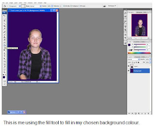
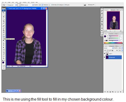
Main image edit
Today in media I edited my main image on photoshop. This is the steps i took;


 Although my central image has changed, I still went through the same steps when editing my new central image.


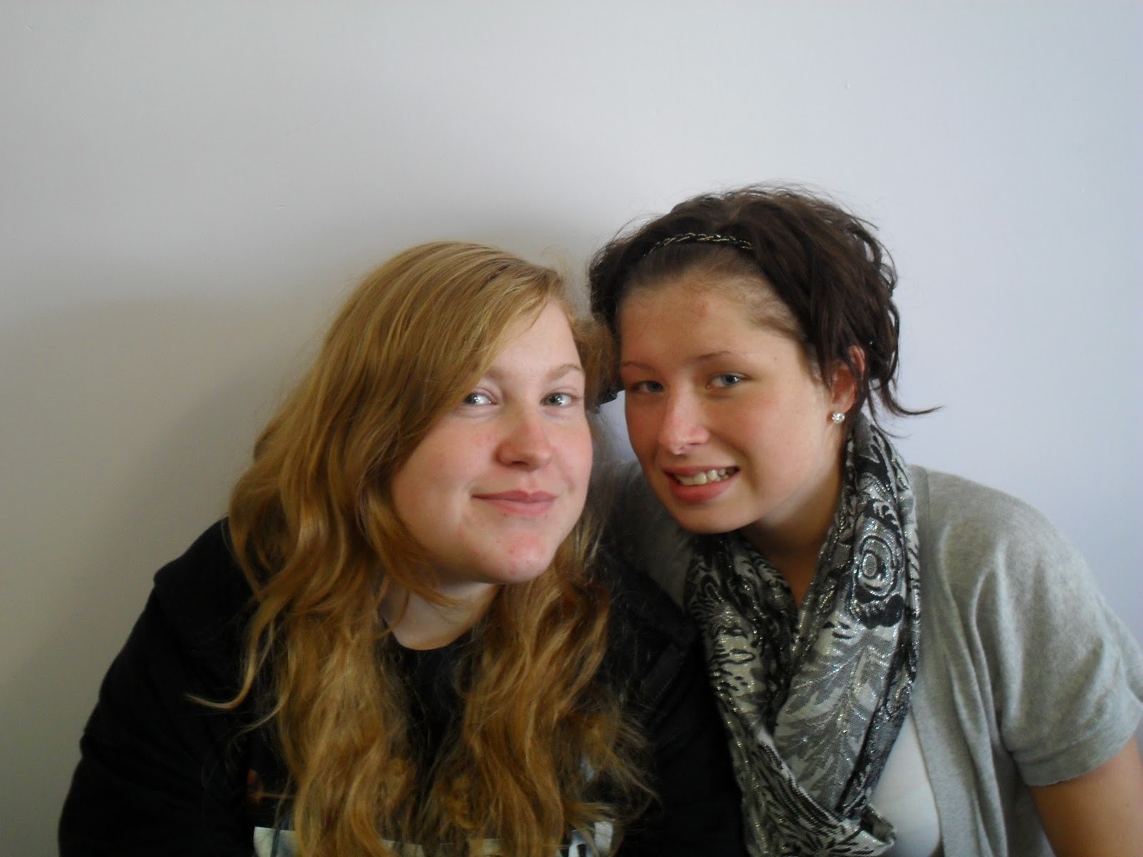
Images for my school magazine
Today in media we took the pictures that we were going to use in our school magazine. These are my pictures;


Wednesday 29 September 2010
Preliminary Exercise
Today in media we sketched out our contents page of our school magazine. Here is my sketch:


Tuesday 28 September 2010
Preliminary Exercise
Today in media we sketched out the front cover of our school magazine. Here is my sketch:


Monday 27 September 2010
Preliminary Exercise
Today in media we started our preliminary exercise. We had to come up with our ideas for my school magazine. My ideas were;
- Title: School Life Weekly.
- Cover lines: 1) Activities this week. 2) Your top 10 favourite teachers. 3) New thing this. week. 4) Newsflash. 5) Pupils Place. 6) Beauty and the Beast - Main Story.
- Misc-en-scene: A girl who is playing belle in Beauty and the Beast.
Thursday 23 September 2010
Camera Shots
Today in media we did a sorting exercise were we had to match up different camera shots with their correct name. We were then given a task sheet with shots in certain situations that we had to take, we went out in groups and completed our tasks. This is my groups work:


Wednesday 22 September 2010
Codes and Connventions of Contents Pages
In media today, we looked at the codes and conventions of music magazine contents pages. We were given 5 magazine contents pages to compare and see what they all had in common. The codes and conventions of music magazine contents pages are;
- Date.
- Logo.
- Headings.
- Buzz words.
- Magazine title.
- Issue Number.
- Page numbers.

 One bigger image.
- Different size pictures.
- They have 2 to 3 columns.
- They usually use size 11 font.
- They have under 10 pictures.
- The font is usually easy on the eye.
- There are categories for the content.
- The pictures link to the stories inside.
- They have a line gap between each section.
- The story index has the same font throughout.
- The page numbers come before the story titles.
- The main image corresponds with the cover story.
- They have pictures that relate to the stories inside.
- Usually has the same colour scheme as the front cover.
- The pictures have captions and page numbers on them.
- The central image links to the main story of the band's music.
- They have the website and subscription on the contents page.
- They use different font and the word contents page is bigger than the rest.
- Notes from the editor about what is inside. It also welcomes new readers in the note.
- Below the pictures, they have some information about the story they represent.
- Credits to the photographer and credits to the photographer of the cover pictures.
- They have feature articles, regulars. There is usually 20 all together depending on the size of the magazine.
- In the list of contents, the page number always comes before the text, followed by a few words e.g. the artists name or an ambiguous texts to intrigue the reader in either bold or capitals, the average font size is 12/13 point.
- A sub line is after this, this tells you a more specific detail about the article, in a smaller and roman font (no bigger than 11 point).
- The masthead is the same as the front cover. They do this to reinforce the brand. Contents page is written within the masthead.
- Contact details; email, phone number, fax and address. They are found in the bottom right corner because it is the least important place on the page.


Tuesday 21 September 2010
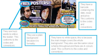
Codes and Conventions of Music Magazines
In media today, we looked at the codes and conventions of music magazines. We were given 5 magazines to compare and see what they all had in common. The codes and conventions of music magazines are;

 There is no white space
- Buzz words, for example; exclusive and new.
- Positioning statement (Usually above or below the title)
- Bar code, contains the date, price, issue number and nowadays, the email address
- The titles are always bold and are usually found in the top left hand corner or across the top. The font is always different from the font used in the rest of the magazine, it is eye-catching and it is larger than the rest of the text.
- They are have a central image and in well known magazines they cover some of the title with the central image.
- The same colour scheme is used throughout and it is usually simple and it is usually 3 to 4 colour that are used.
- Cover lines represent the stories inside, they are all in the same font and there are usually 5 to 6 of them on a cover. The cover lines are smaller than the title but bigger than the other text on the page.
- All the text is centred around the central image. The text also anchors the main image and there is always picture, text cohesion.
- The colours do not clash and they are easy on the eye.
- They use close-up shots or medium close- ups.
- On a cover, you do not want too much or too less. They use long shots for a bands photographs.
- They use a plain background because it is formality.
- Masthead (Magazine title). They make the genre clear.
- They use smaller pictures which relate to the stories inside.
- The main cover line goes with the main picture.
- They only use a few font, usually Serif e.g. Times new Roman, or sans


Subscribe to:
Posts (Atom)